
Greetings again, Dear Readers! Time for the next installment of Scribe Stuff. This time, as promised, I will show you just how simple it is to move from doing a preprint scroll to completing a “real” original scroll. Spoiler Alert: It is a baby step.
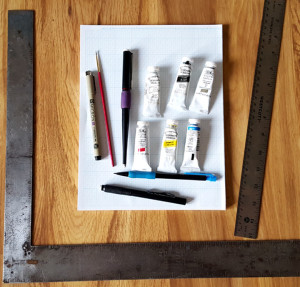
You will need the following equipment:
- Calligraphy pen
- Paint
- Brush/es
- Water cup
- Ruler
- Compass or circle template
- Graph Paper
The one thing I hear as a Scribe Laurel is “oh, I will help paint preprints, but I am nowhere near good enough to do a “real” scroll.” This is second only to “I don’t do calligraphy” or “I don’t do illumination” or “I can’t do calligraphy/illumination because….” All of the above are nonsense. You can do them, if you choose to learn and practice. Practice is key, just like any other skill. There are other keys and we will cover some of them here.
Another key is “There is almost NO difference between working on a preprint and doing an original scroll.” This is especially true if you have done the line artwork or calligraphy for a preprint scroll before. Regardless, there is no reason to continue only painting inside the lines of preprinted scrolls forever, unless that is all you truly want to do. IF you want to move forward and learn to start doing some original work, this is the place to start.
Reference my prior Falcon Banner article “What Does it Take to Start Doing Calligraphy and Illumination”
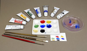
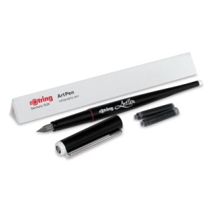
The basic materials are the same – a calligraphy pen (dip or cartridge), a right angle, a circle (circle template or compass), graph paper, and a liner pen (Micron, Rotring Art pen, crow quill dip pen). Add the paints, brushes and water you would use to paint inside the lines to color a preprint, plus some gold and an appropriate white liner, and you have the basic makings of an original scroll.
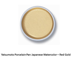
Yatsumoto Gold Watercolor Gouache in Ceramic Pan – one of my personal favorite golds
There are some short cuts, which we will cover and some of which are even period to some extent. Cheating, by the way, IS period. After all, scribes of the Middle Ages simply copied text after text, making mistake upon mistake until we got documents essentially unrecognizable from the originals.
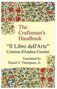
The start of a “real” scroll is exactly like that of a preprint, so refer to the Falcon Banner article for details. In short, I keep a sketchbook and a file folder of “good art” that I have done, others have done, inspiration material, etc. I have a resource list a mile long, Pinterest boards that are embarrassingly huge, and a library that could bankroll my retirement. There are a few essential books – such as Mark Drogin’s Medieval Calligraphy, which are absolutely required for calligraphers. The Craftsman’s Handbook by Cennini is another which I recommend you purchase early in your scribal career.
I lay out the basics of the scroll – margins, space for artwork and space for text – first on graph paper. Then I find a font on the computer that approximates the one from period that I want to use. It may not have all the finery and so forth, but the roundness or lack thereof, the spacing of the letters, and the “time period feel” are all similar to that of the final scroll I envision. I play around with the scroll text in MS Word, using the font choices. I have spent too much time on the Internet, downloading and installing medieval styled fonts, so I have something like 200+ from which to choose.
I work with the text to get it sized, spaced (both words AND letters, as well as between lines) correctly for the space involved, and print it off underlined when it fits the final form. Why underlined? All the easier to line up with my graph paper, of course! Why make it harder?
I also increase the same font and change the font style to outline for any rubricated (decorated) capital letters that the scroll will include so they will match the text. I make sure these are the approximate size I need for the final scroll, and print these too.
(c) Aidan Cocrinn OL, mka Holly Cochran 2016
In the end, I have balanced blocks of text as well as larger initials ready to be added to the graph paper rough draft. Remember – we are still in the phase that matches the preprint design stage exactly.
Next, I review my source books, online sources and stored drawings and other resources for inspiration and design elements appropriate to the text and time period. If there is an Order Badge to include in the design, I make the decision whether to include this as a badge per se or as the main charge (i.e. a Pelican) woven throughout the overall design. Either is appropriate for a GoA or Peerage scroll.
If I am using just the badge, I can print these directly from the Kingdom heralds page (Calontir Armorial – Awards and Badges). This also has the individual armory of each person with a registered device in picture form as well as heraldese). I call these sites my Electronic Apprentices.
I can download, save and desaturate (turn into black and white line drawings) any of the badges of Calontir awards, or of the various members of the populace. I can also save and print them as full color drawings. I can resize them until they fit the spaces of my design, print, then cut and paste into the graph paper rough draft.
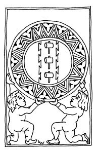
Leather Mallet artwork by Lucinda Whyteland
® Lucinda Wilson 2016
Your rough draft, with its pasted text, badge, and possibly the recipient’s own device, is starting to look pretty rough indeed at this point. All is well. You are nearly done with this phase. All that is left is to connect the spaces between any large capital letters and the device or device motif.
This can be done with vine work (see WHEE demonstration and practice for tips on how to stay loose and make great circles and loops), Celtic knot work, diapered and gold-worked bar and ivy designs and more depending on the style of the scroll. The style must be consistent with the style and time frame of the text.
I often take inspiration from my various resource materials such as my personal collection of copies and books, as well as from online sources and additional research. I personally think it is important to make note that this work is based on, including the name of extant work/s from period either in a separate document attached to the scroll or written lightly in pencil on the back of the final scroll. The same goes for credit to the text writer.
Now is the place for your next major scroll hack or “cheat,” which is not really a cheat at all. Period scribes were known to trace – this is well documented. At times, they covered the back of their sketched work with colored chalky pigment, and then traced the design lightly using a stylus onto the “good paper.” Referencing the sketchbooks of Michelangelo, Durer and many others gives you an idea of just how much of this kind of transfer occurred.
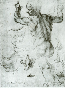
Michelangelo – Sketch for Sistine Chapel
Another method used was to place the rough draft over the good piece of paper and trace over the design with a sharp pen or crown quill, or poke holes around the design to make indents where scroll text and design elements are intended. In period, scribes would use glass windows or tabletops, or they would use pins to prick the design throughout to use as a “connect the dots” method of tracing the image from rough draft to final page. Regardless of the method, short of photocopying one to the other, it is pretty much period. Using a glass-topped scribe’s desk with a low-heat emitting LED light-pad, I transfer the image from the rough draft to the “good” paper.
Once the design and calligraphy are transferred to the good paper, I use the ink calligraphy pen -mine is a Rotring Art pen, and the liner pen such as the Rotring Art Pen sketch pen or the Micron liner pen, to trace the design onto the good paper. I have now essentially created the master copy of a preprint scroll, if this were not to be a Grant or Peerage level original scroll to award.
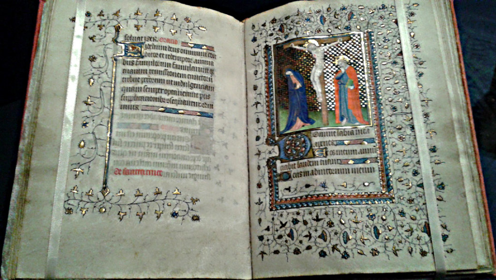
Once the black ink is very thoroughly dry, I can begin illumination work on the piece. I review my references once more, for colors and shading used and other things unique to that style of art. For instance – what was done in early Irish manuscript painting around 500-700 A.D. was not nearly the same as 1500-600 A.D. Ireland! One should never mix time periods that far apart. I keep mine within about 50 years of each other. Whenever possible, I refer to the original source. Online research libraries are a huge help for this – allowing us to see things we never saw before!
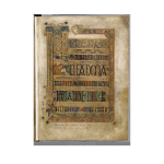
Book of Kells
Illuminating my line-drawn design is no different from painting in a preprint. I use the same materials – gouache paint, for the most part, and gold gouache, leaf, or other gold supplies if needed for illumination, and a way to create white line, bar and ivy work as needed. I also work my paints to develop both a mid-tone as well as a light and dark tone for the colors in use, especially clothing drapery, faces, hair, etc.
Start with the gold work, as a rule. Other paints to do not stick to gold and you need to make absolutely sure the gold is done correctly. Learn to use either gold gouache, Sumi-e gold paint, or gold leaf techniques. None is particularly hard, but they are costly and time-consuming.
Once the gold is applied and trimmed so that the black lines around it show, I add the paint. I start with the lightest paint base colors and move towards darker shades as each element in the scroll is completed. The reasoning for this is simple – dark paint covers errors made with lighter paint. Trying to fix errors the other way ’round doesn’t work as well. I try to work around the scroll, completing one element or feature at a time, rather than doing “all the greens at once,” and then “all the reds” next.
Once all the initial layers of paint and calligraphy ink have dried, while the scroll is lying flat between two sheets of absorbent cotton or fiber towels (because, cats), I take the opportunity to clean up my workstation. I review my material and make sure the colors and design I used match with the text written and style desired by the recipient.
This is the time to add personalizing touches to the scroll. Is the recipient’s heraldry displayed somewhere? Do they belong to a household; are they also great at some other skills? Show those in the illumination, too. Add diaper patterns, highlights, low lights shading etc. to finish the scribery.
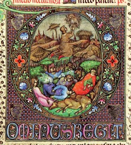
Elaborate piece from the Visconti Hours
Finish up by cleaning up any messes on the scroll – a Q-trip dipped in bleach then gently rolled across the surface of the paper wonders for this. Be sure to blot the area with a dry paper towel to remove excess fluid and help dry the paper. When it is very dry, buff it out with a light application of the white rubber eraser to restore the “tooth” of the paper.
The very end phase, once everything is completely dried, is to spray a light coating of Workable Fixatif on the surface of the scroll. This product ensures minor drips of sweat will not ruin the scroll, nor impair the ability of Their Majesties to sign the thing before Court. Gently erase all pencil lines with the white rubber eraser before applying the spray. If a line or image drawing will not erase completely, do not worry and leave it be. Do not scrub at it and make the problem worse.
Do a final check of your work. Does it meet the requirements of the recipient, or their sponsor and the Order? Does the time period of the text agree with the time of the illumination? Is the badge of the Order correct? Are there places where the outline needs a touchup?
Now, walk away from the work for at least a day. Do not look at it. Do something completely non-scribal. Come back and look at the work with fresh eyes after a time. Recheck the work again, find any last fixes to fix – try those erasures again, clean up smudges, that sort of thing. Do not try to rework the illumination. At most, add a bit of white work if the illumination requires it, but nothing more than embellishments.
Add your maker’s mark to the front of the scroll and write “Scroll done by …” and your name in pencil on the back of the scroll. I like to add any sources I used, such as “based on the Lindisfarne Gospel, panels 9 and 22” or something like that. If someone else wrote the text, also write their credits on the back of the scroll in pencil.
Take at least one good quality photo of the scroll that shows the entire item. Also, take close up shots of any detail work. Start a portfolio of your work on your computer. Save the graph paper version rough draft of the scroll, and copy any favorite elements to your sketchbook or model book.
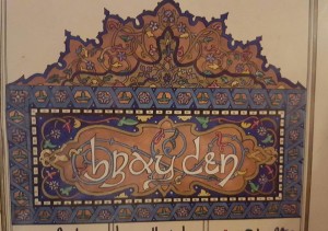
Top Piece of Duchess Brayden’s Scroll (c) Aidan Cocrinn mka Holly Cochran 1993
Print 2 copies of the text in a simple typeface such as Arial or Calibri font, size 14 or so, one for the voice herald and one for the silent herald. Deliver the scroll and plain texts to the Royal Scribe.
Congratulations! You have completed a “Real Scroll” using nothing more than the skills you learned doing preprints.
Aidan Cocrinn, OL
55th Laurel of Calontir by the Grace of Conn and Sile
Royal Scribe to Their Majesties Matsunaga and Elena
First Cyborg Laurel of Calontir
Scribe Goob


You must be logged in to post a comment.