
Scribe’s Desk
The Book of Kells Online
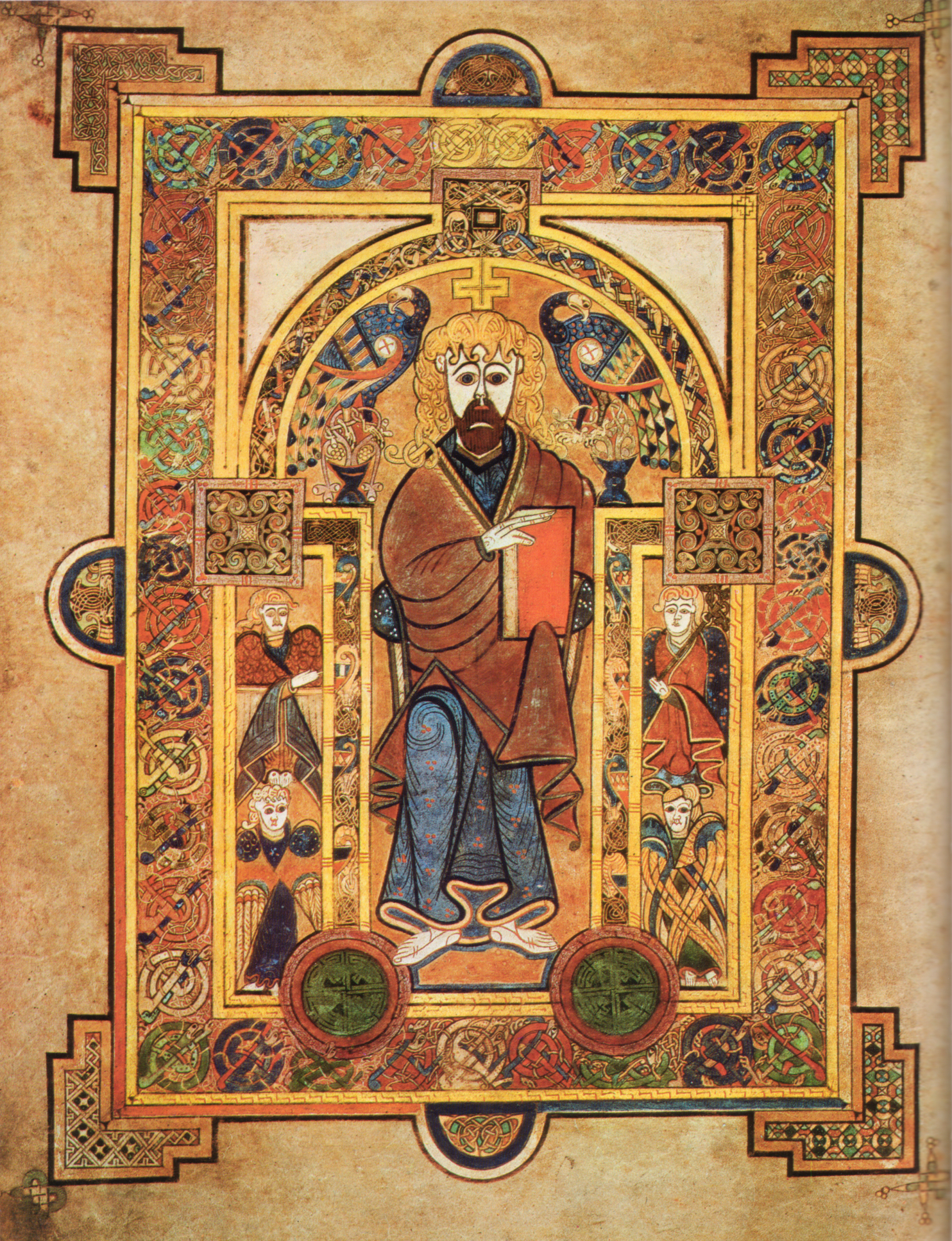
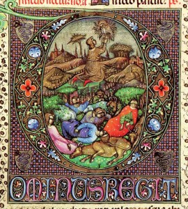
Book of Kells, Folio 32v, Christ Enthroned. c. 800 AD
As technology marches on, many resources that were difficult — even impossible — to obtain, have been made available digitally for scholars to view and explore. Recently, Trinity College Dublin added The Book of Kells to their online digital collection.
The Book of Kells is an illustrated manuscript of the Four Gospels, in Latin. It was produced by Columban monasteries in either Ireland or Britain (or possibly with contributions from both) in approximately 800 AD. The manuscript has a fascinating history of survival over the centuries.
The Illustrations have had a major influence on the common perception of early Medieval, and especially insular Celtic, art since the first accurate reproductions were produced and published in the mid-19th century. The calligraphy has also come to represent Celtic lettering for many people. Elements and examples of both are often reproduced in SCA artwork.
The online collection is available at https://digitalcollections.tcd.ie/home/index.php?DRIS_ID=MS58_003v
The Making of a Scroll: Pelican Scroll for Alessandra de Piro
Baroness Ayisha bint Asad describes the construction of the scroll presented to Mistress Alessandra de Piro
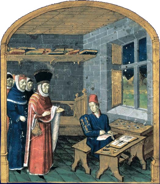
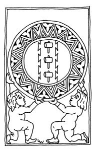
Copyist-illuminator. Mid-15th Century. Public domain in the US
Silver Hammer Scroll for Thaddeus Ellenbrock
Silver Hammer Scroll for Sir Thaddeus Ellenbrock
Text, Calligraphy and Illumination by Mistress Rahil al-Sirhaan.
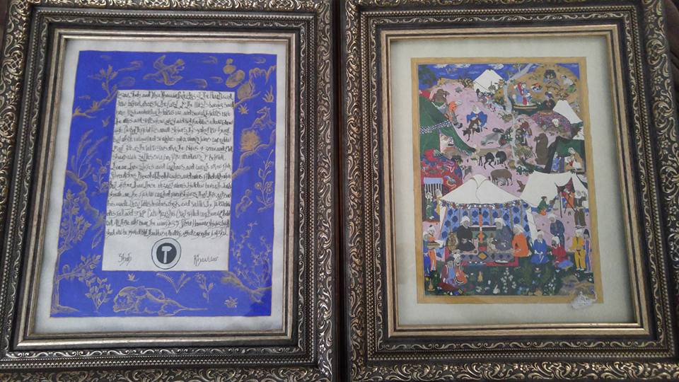
Photo courtesy of Mistress Rahil
Logan, Shah, and Ylva, Khanum,
Protectors of the Heartland
From forked rivers in the East
To the West’s burning sand,
Have listened well with Falcon’s ear
And seen with Falcon’s eye
The works and skills of an artist
And bid Thaddeus Ellenbock draw nigh.
On battlefield his armor shines,
This valiant lion-heart,
But while encamped on water’s edge
Warrior turns carpentry to art.
For as the Falcon soars above
The plains of green and gold,
Sharp eye settles on a pavilion,
Wondrous to behold.
There are tapestries and lanterns,
And carpets woven fine,
Silver dishes topped with delicacies,
And ewers filled with wine.
But richer than these elegant wares,
Hidden beneath tent’s shade
Are the finely crafted furnishings
That this artisan has made.
Upon tables, benches, chests and saddles
The Falcon eye does fall
And so into Calon Majesties’ Court
Skilled craftsmen do They call.
All those who bear the markings
Of Silver Hammer shining bright
Shall now be joined by Thaddeus Ellenbock,
The noted carpenter knight.
Silver Hammer Scroll for Viga-Valr viligísl, known as Vels
Silver Hammer Scroll for THL Viga-Valr viligísl, known as Vels
Text by Mistress Bridget Edan, Lady Izza bint Zaqara, THL Marcella the Unknown, Master Eadweard Boisewright, Lady Mor Hoistlair and Master Gottfried Von Koln. Calligraphy and Illumination by HL Lavilla Senestor
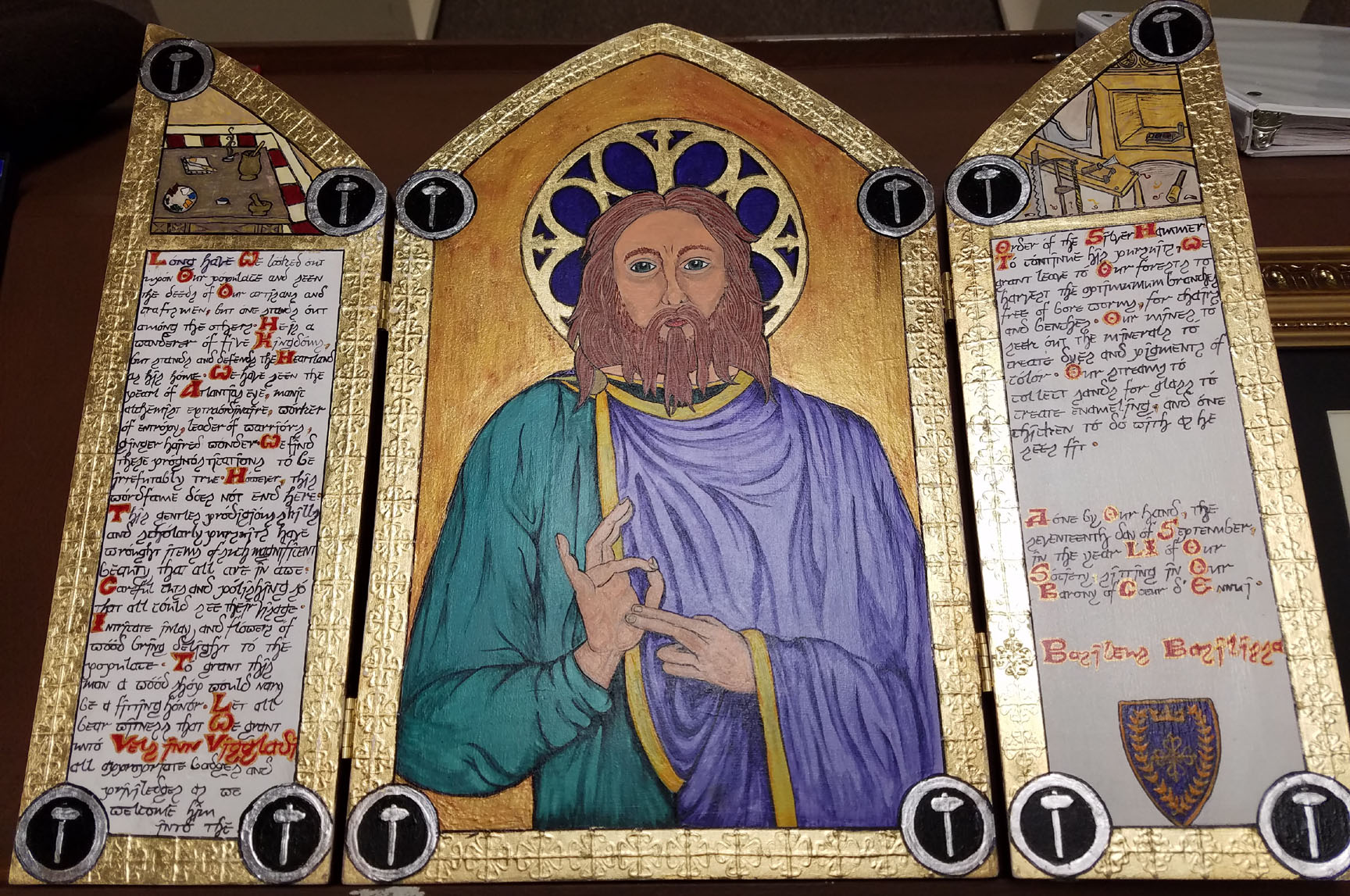
Silver Hammer Scroll for THL Viga-Valr viligísl, known as Vels
Long have We looked out upon Our populace and have seen the deeds of Our artisans and craftsmen but one stands out among others. He is a wanderer of five Kingdoms but stands and defends the Heartland as his home. We have seen the pearl of Atlantia’s eye, manic alchemist extraordinaire, worker of entropy, leader of warriors, ginger haired wonder, and We find these prognostications to be irrefutably true; however this wordfame does not end here.
This gentle’s prodigious skills and scholarly pursuits have wrought items of such magnificent beauty that all are in awe. Careful cuts and polishing so that all could see their visage, intricate inlay and flowers of wood bring delight to the populace. To grant this man a wood shop would nary be a fitting honor.
Let all bear witness that We grant unto Viga-Valr viligísl all appropriate badges and privileges as we welcome him into the Order of the Silver Hammer.
To continue his pursuits, We grant leave to Our forests to harvest the optimum branches free of bore worms for chairs and benches, Our mines to seek out the minerals to create dyes and pigments of color, Our streams to collect sands for glass to create enameling and one chicken to do with as he sees fit.
Done by our hand, the seventeenth day of September, in the year 51 of Our Society sitting in Our Barony of Coeur d’Ennui.
(Logan) (Ylva)
Basileus Basilissa
Count and Countess Scroll for Their Excellencies Matsunaga and Elena
Count and Countess Scroll for Their Excellencies Matsunaga and Elena
Presented by Logan kunung and Ylva drottning at Coronation July 9, AS 51 (2016)
By Aidan Cocrinn, OL © Holly Cochran July 2016
One of the many highlights of Summer Coronation, held July 9, 2016 in the Barony of Coeur d’Ennui, was the investiture of Matsunaga and Elena as Count and Countess. In commemoration of their Reign, both received their County coronets from the hands of their Heirs, Logan and Ylva. In addition, scrolls with the words of the new Crown were presented. Below are the texts of those scrolls, along with photos. Truly, both awards were wonders to behold.
Aidan Cocrinn, OL
Royal Scribe for Matsunaga and Elena, with gratitude and thanks for that great honor
Countess Scroll for Her Excellency Elena text was crafted by Mistress Ishmala bint Yuhannah. The scroll itself was created by Baroness Neathery of Safita.
Right trusty and well-beloved we greet you well. It hath pleased the goodness of Almighty God of his infinite mercy and grace to deliver unto this glorious kingdom this great lady called Elena Moreno del Mar. By the prowess and might of Matsunaga Kagetora she was made his consort and brought great joy and comfort to all the good and loving subjects of the realm. This singular rose has mighty thorns and shielded her people on campaign when the winds turned tempest, she gave wise council to all, and kept her head at all times.
It is our great pleasure and inward desire that you continue to give comfort and consolation to our people. We therefore by this letter advise you that you are made a countess of our realm and are given lands equal to our esteem for you. We bequeath you the Wardenry of Royal Forests near the Crystal Mines where you may build a home with no less than four chimneys and may hunt and hawk at your pleasure.
We undoubtedly desire that you continue to give laud and praise to all subjects of our heart regardless of rank, and pray for the good health, prosperity, and continual preservation of our realm.
Given under our signet in the Barony of Coeur d’Ennui this 9th day of July, in the 50th year of our Society.
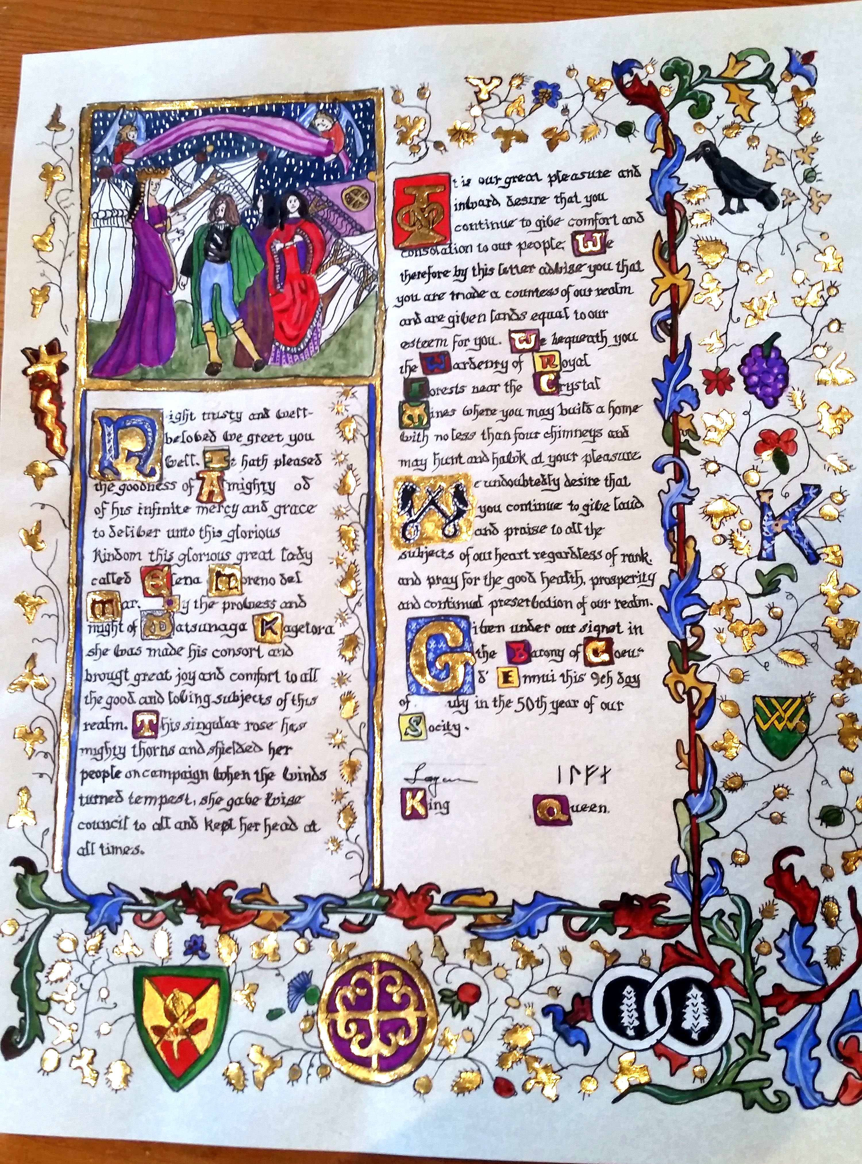
Scroll by Baroness Neathery of Safita, text by Mistress Ishmala bint Yuhannah
The County scroll for Matsunaga was created by Viscount Master Christopher Reuben Montoya, formerly of Atenvelt, now residing in Grimfells. The text was crafted by Master Andrixos.
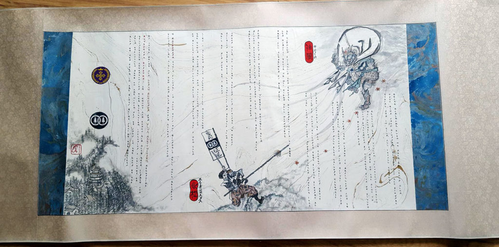
Cease Kamikaze
Blow no more, heavenly wind
Upon King, upon Kingdom
Rising Sun has brought storm’s end
In calm, all recall tempest
Reclaim lost pillow
Traveler’s cushion far wandered
From home of the dawn
To land entranced by sunsets
Path of pillow was king’s road
Brought from the Nippon
To Heartland and to Shogun
Hail, Matsunaga.
Wind-driver and wind-driven
Strong gale blew through Calontir
Eight corners he saw
As Falcon soaring above
Lifted by wind’s strength
Soft breeze brought he to the land
Spring’s zephyrs caused winter’s rout
He subdued blizzard
And sought stronger storm to test
Led samurai south
To war field well windswept
Foes all dispersed by his gust
Gods keep man humble
After victor’s council held
Divine bellows turned
Brought rain like forge’s fire
Fortress strong sacked by wind-flood
Among folk he strode
Seeing aid brought to needy
Raising homes sunk low
Sheltering people from fear
Here he did gust as a king
Like a willow tree
Falcon tribe withstood the storm
Plans for new fortress
Stories of maelstroms survived
Realm prepared for a new calm
O Matsunaga
Storm bringer in war’s fury
For kingship, well worn.
Headband bright like Rising Sun
And high honors earned granted.
By these words did Duncan Rex and Ylva Regina recognize Matsunaga Kagetori as a Count, and endow him with such rights and obligations accompanying such elevation, including a coronet of gold embattled. Done on the ninth day of July in the Land of the Ring of Red Boars, in the fifty first year of the Society
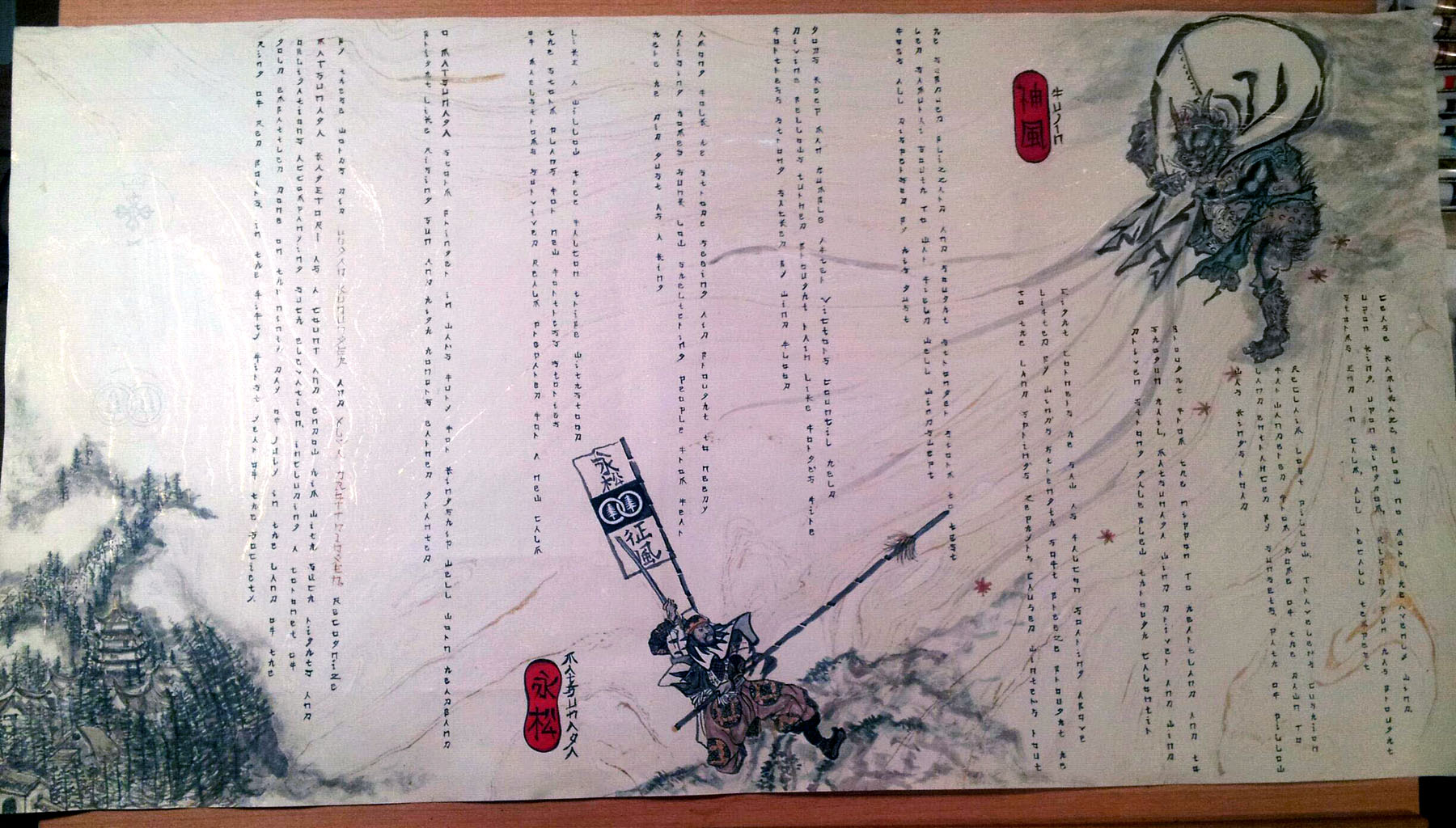
Scroll by Viscount Master Christopher Reuben Montoya, words by Master Andrixos Seljukroctonis
From the artist: It is written in the Japanese form of 10 Tankas; A 57577 syllable arrangement. The scroll itself is done with Sumi-e (black ink brush, and the painting depicts Fujin, the Japanese wind god, and Matsunaga fighting while His Excellency is protecting beloved Calontir behind him. The scroll text is in English, scribed in Japanese letter characters. It is written in the “kanji” form (vertical columns/right to left) over Suminagashi (floating ink or marbled) paper. The Silk horizontal scroll frame is by Blue Heron Arts and mounting was done by the scribe.
Next from this author: H.L. Vels created an amazing addition to the Royal Scribe’s office, which was gifted to TRM and the RS Office at Coronation. Read ALL the details and see the amazing close-up photos in the next article.
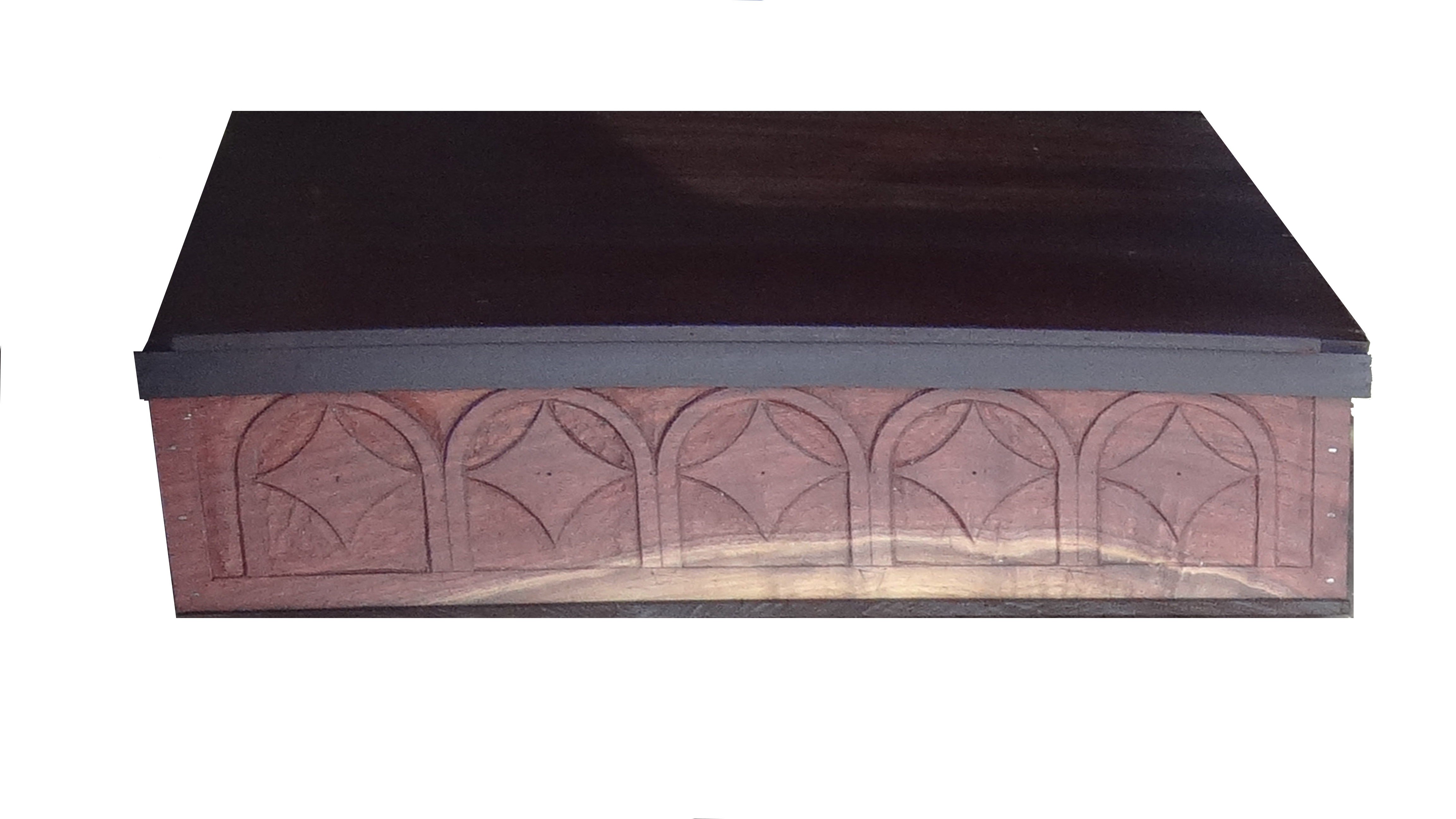
Royal Scribe Box by HL Vels- Front Panel. Just a teaser!
CORRECTION: This post has been corrected to reflect Mistress Ishmala bint Yuhannah as the author of the scroll text for Countess Elena. Also, Viscount Master Christopher originally hails from Atenveldt. The author deeply regrets these errors.
Save
Taking the Leap: Moving from Painting Preprints to Doing Original Scroll
Greetings again, Dear Readers! Time for the next installment of Scribe Stuff. This time, as promised, I will show you just how simple it is to move from doing a preprint scroll to completing a “real” original scroll. Spoiler Alert: It is a baby step.
You will need the following equipment:
- Calligraphy pen
- Paint
- Brush/es
- Water cup
- Ruler
- Compass or circle template
- Graph Paper
The one thing I hear as a Scribe Laurel is “oh, I will help paint preprints, but I am nowhere near good enough to do a “real” scroll.” This is second only to “I don’t do calligraphy” or “I don’t do illumination” or “I can’t do calligraphy/illumination because….” All of the above are nonsense. You can do them, if you choose to learn and practice. Practice is key, just like any other skill. There are other keys and we will cover some of them here.
Another key is “There is almost NO difference between working on a preprint and doing an original scroll.” This is especially true if you have done the line artwork or calligraphy for a preprint scroll before. Regardless, there is no reason to continue only painting inside the lines of preprinted scrolls forever, unless that is all you truly want to do. IF you want to move forward and learn to start doing some original work, this is the place to start.
Reference my prior Falcon Banner article “What Does it Take to Start Doing Calligraphy and Illumination”
The basic materials are the same – a calligraphy pen (dip or cartridge), a right angle, a circle (circle template or compass), graph paper, and a liner pen (Micron, Rotring Art pen, crow quill dip pen). Add the paints, brushes and water you would use to paint inside the lines to color a preprint, plus some gold and an appropriate white liner, and you have the basic makings of an original scroll.
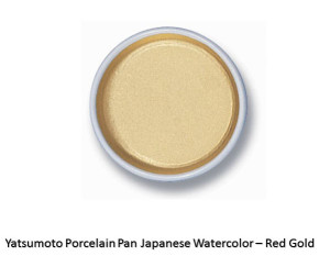
Yatsumoto Gold Watercolor Gouache in Ceramic Pan – one of my personal favorite golds
There are some short cuts, which we will cover and some of which are even period to some extent. Cheating, by the way, IS period. After all, scribes of the Middle Ages simply copied text after text, making mistake upon mistake until we got documents essentially unrecognizable from the originals.
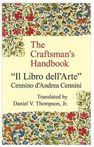
The start of a “real” scroll is exactly like that of a preprint, so refer to the Falcon Banner article for details. In short, I keep a sketchbook and a file folder of “good art” that I have done, others have done, inspiration material, etc. I have a resource list a mile long, Pinterest boards that are embarrassingly huge, and a library that could bankroll my retirement. There are a few essential books – such as Mark Drogin’s Medieval Calligraphy, which are absolutely required for calligraphers. The Craftsman’s Handbook by Cennini is another which I recommend you purchase early in your scribal career.
I lay out the basics of the scroll – margins, space for artwork and space for text – first on graph paper. Then I find a font on the computer that approximates the one from period that I want to use. It may not have all the finery and so forth, but the roundness or lack thereof, the spacing of the letters, and the “time period feel” are all similar to that of the final scroll I envision. I play around with the scroll text in MS Word, using the font choices. I have spent too much time on the Internet, downloading and installing medieval styled fonts, so I have something like 200+ from which to choose.
I work with the text to get it sized, spaced (both words AND letters, as well as between lines) correctly for the space involved, and print it off underlined when it fits the final form. Why underlined? All the easier to line up with my graph paper, of course! Why make it harder?
I also increase the same font and change the font style to outline for any rubricated (decorated) capital letters that the scroll will include so they will match the text. I make sure these are the approximate size I need for the final scroll, and print these too.
(c) Aidan Cocrinn OL, mka Holly Cochran 2016
In the end, I have balanced blocks of text as well as larger initials ready to be added to the graph paper rough draft. Remember – we are still in the phase that matches the preprint design stage exactly.
Next, I review my source books, online sources and stored drawings and other resources for inspiration and design elements appropriate to the text and time period. If there is an Order Badge to include in the design, I make the decision whether to include this as a badge per se or as the main charge (i.e. a Pelican) woven throughout the overall design. Either is appropriate for a GoA or Peerage scroll.
If I am using just the badge, I can print these directly from the Kingdom heralds page (Calontir Armorial – Awards and Badges). This also has the individual armory of each person with a registered device in picture form as well as heraldese). I call these sites my Electronic Apprentices.
I can download, save and desaturate (turn into black and white line drawings) any of the badges of Calontir awards, or of the various members of the populace. I can also save and print them as full color drawings. I can resize them until they fit the spaces of my design, print, then cut and paste into the graph paper rough draft.
Leather Mallet artwork by Lucinda Whyteland
® Lucinda Wilson 2016
Your rough draft, with its pasted text, badge, and possibly the recipient’s own device, is starting to look pretty rough indeed at this point. All is well. You are nearly done with this phase. All that is left is to connect the spaces between any large capital letters and the device or device motif.
This can be done with vine work (see WHEE demonstration and practice for tips on how to stay loose and make great circles and loops), Celtic knot work, diapered and gold-worked bar and ivy designs and more depending on the style of the scroll. The style must be consistent with the style and time frame of the text.
I often take inspiration from my various resource materials such as my personal collection of copies and books, as well as from online sources and additional research. I personally think it is important to make note that this work is based on, including the name of extant work/s from period either in a separate document attached to the scroll or written lightly in pencil on the back of the final scroll. The same goes for credit to the text writer.
Now is the place for your next major scroll hack or “cheat,” which is not really a cheat at all. Period scribes were known to trace – this is well documented. At times, they covered the back of their sketched work with colored chalky pigment, and then traced the design lightly using a stylus onto the “good paper.” Referencing the sketchbooks of Michelangelo, Durer and many others gives you an idea of just how much of this kind of transfer occurred.
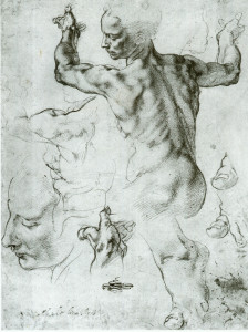
Michelangelo – Sketch for Sistine Chapel
Another method used was to place the rough draft over the good piece of paper and trace over the design with a sharp pen or crown quill, or poke holes around the design to make indents where scroll text and design elements are intended. In period, scribes would use glass windows or tabletops, or they would use pins to prick the design throughout to use as a “connect the dots” method of tracing the image from rough draft to final page. Regardless of the method, short of photocopying one to the other, it is pretty much period. Using a glass-topped scribe’s desk with a low-heat emitting LED light-pad, I transfer the image from the rough draft to the “good” paper.
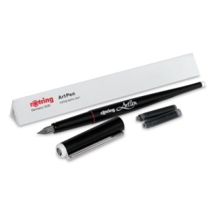
Once the design and calligraphy are transferred to the good paper, I use the ink calligraphy pen -mine is a Rotring Art pen, and the liner pen such as the Rotring Art Pen sketch pen or the Micron liner pen, to trace the design onto the good paper. I have now essentially created the master copy of a preprint scroll, if this were not to be a Grant or Peerage level original scroll to award.
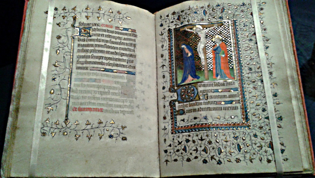
Once the black ink is very thoroughly dry, I can begin illumination work on the piece. I review my references once more, for colors and shading used and other things unique to that style of art. For instance – what was done in early Irish manuscript painting around 500-700 A.D. was not nearly the same as 1500-600 A.D. Ireland! One should never mix time periods that far apart. I keep mine within about 50 years of each other. Whenever possible, I refer to the original source. Online research libraries are a huge help for this – allowing us to see things we never saw before!
Book of Kells
Illuminating my line-drawn design is no different from painting in a preprint. I use the same materials – gouache paint, for the most part, and gold gouache, leaf, or other gold supplies if needed for illumination, and a way to create white line, bar and ivy work as needed. I also work my paints to develop both a mid-tone as well as a light and dark tone for the colors in use, especially clothing drapery, faces, hair, etc.
Start with the gold work, as a rule. Other paints to do not stick to gold and you need to make absolutely sure the gold is done correctly. Learn to use either gold gouache, Sumi-e gold paint, or gold leaf techniques. None is particularly hard, but they are costly and time-consuming.
Once the gold is applied and trimmed so that the black lines around it show, I add the paint. I start with the lightest paint base colors and move towards darker shades as each element in the scroll is completed. The reasoning for this is simple – dark paint covers errors made with lighter paint. Trying to fix errors the other way ’round doesn’t work as well. I try to work around the scroll, completing one element or feature at a time, rather than doing “all the greens at once,” and then “all the reds” next.
Once all the initial layers of paint and calligraphy ink have dried, while the scroll is lying flat between two sheets of absorbent cotton or fiber towels (because, cats), I take the opportunity to clean up my workstation. I review my material and make sure the colors and design I used match with the text written and style desired by the recipient.
This is the time to add personalizing touches to the scroll. Is the recipient’s heraldry displayed somewhere? Do they belong to a household; are they also great at some other skills? Show those in the illumination, too. Add diaper patterns, highlights, low lights shading etc. to finish the scribery.
Elaborate piece from the Visconti Hours
Finish up by cleaning up any messes on the scroll – a Q-trip dipped in bleach then gently rolled across the surface of the paper wonders for this. Be sure to blot the area with a dry paper towel to remove excess fluid and help dry the paper. When it is very dry, buff it out with a light application of the white rubber eraser to restore the “tooth” of the paper.
The very end phase, once everything is completely dried, is to spray a light coating of Workable Fixatif on the surface of the scroll. This product ensures minor drips of sweat will not ruin the scroll, nor impair the ability of Their Majesties to sign the thing before Court. Gently erase all pencil lines with the white rubber eraser before applying the spray. If a line or image drawing will not erase completely, do not worry and leave it be. Do not scrub at it and make the problem worse.
Do a final check of your work. Does it meet the requirements of the recipient, or their sponsor and the Order? Does the time period of the text agree with the time of the illumination? Is the badge of the Order correct? Are there places where the outline needs a touchup?
Now, walk away from the work for at least a day. Do not look at it. Do something completely non-scribal. Come back and look at the work with fresh eyes after a time. Recheck the work again, find any last fixes to fix – try those erasures again, clean up smudges, that sort of thing. Do not try to rework the illumination. At most, add a bit of white work if the illumination requires it, but nothing more than embellishments.
Add your maker’s mark to the front of the scroll and write “Scroll done by …” and your name in pencil on the back of the scroll. I like to add any sources I used, such as “based on the Lindisfarne Gospel, panels 9 and 22” or something like that. If someone else wrote the text, also write their credits on the back of the scroll in pencil.
Take at least one good quality photo of the scroll that shows the entire item. Also, take close up shots of any detail work. Start a portfolio of your work on your computer. Save the graph paper version rough draft of the scroll, and copy any favorite elements to your sketchbook or model book.
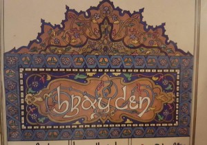
Top Piece of Duchess Brayden’s Scroll (c) Aidan Cocrinn mka Holly Cochran 1993
Print 2 copies of the text in a simple typeface such as Arial or Calibri font, size 14 or so, one for the voice herald and one for the silent herald. Deliver the scroll and plain texts to the Royal Scribe.
Congratulations! You have completed a “Real Scroll” using nothing more than the skills you learned doing preprints.
Aidan Cocrinn, OL
55th Laurel of Calontir by the Grace of Conn and Sile
Royal Scribe to Their Majesties Matsunaga and Elena
First Cyborg Laurel of Calontir
Scribe Goob
Scribe 101: What Does It Take To Start Doing Calligraphy and Illumination
Most of you, Dear Readers, won’t believe me when I say the basic materials for starting your career as a scribe are incredibly minimal. Primitive, perhaps, is a more apt word.
Many protest they cannot Scribe because their handwriting is horrific and they have no artistic skill. Handwriting is irrelevant, as is your artistic talent and even whether you are left or right handed. What matters is the willingness to learn and practice, openness to trying a new skill and the ability to understand the difference between handwriting and the Scribal Arts.
I’ve been doing this for more years than I’d care to admit. In a pinch, it takes very little to draw pretty letters and make a decent-looking scroll, even under less than ideal conditions. One of my articles down the road will cover “Combat Scribing: The Art and Science of Doing a Scroll under Horrible Conditions.” This is also known as doing a last minute scroll at Lilies War.

My Rolling Scribe Box looks just like this, except it is camo green.
You do not need my rolling Scribe Box of Wonders, plus a home scribe room full of more cool stuff to do scrolls. At some point, more stuff becomes a distraction. We will start with the bare basics. This series will build from there. Eventually, you will find personal favorites to add to your Kit, as well finding things you feel convenient or helpful beyond the basics.
The Scribe’s Library will grow, too. Invest in Amazon Prime, and learn to scour every method of acquiring good quality used books, as well. Bargain shopping for books will serve you well for your entire Scribe career.
At the end of this article, I list some online resource and essential Scribe books. Always seek online coupon and discount codes before shopping. Free shipping is the most common. Some merchants have begun to recognize the SCA as a significant constituent and offer an SCA discount at checkout. Ask for it. Join all the SCA Scribes related Facebook groups you can find, and get hooked on Pinterest Scribe boards for more online inspiration and resource generators.
Even a few decades ago, these resources were not available, yet now they are lifesavers. Find the online digitized manuscript treasuries and bookmark them. Take classes at RUSH (Royal University of Scir-Havoc) or elsewhere, plus ask a more experienced Scribe if you can sit with them and ask questions. After all, most Scribal Arts are done alone, at home, in our workshops. It is much akin to raising small children– after a while; Scribes long for adult conversation!
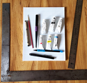
Bare Bones Scribe Materials
Shown above – a right-angle, a straight edge, graph paper, a calligraphy pen, a liner pen, a pencil, a white eraser, a paint brush, and gouache in the three primary colours (red, blue, yellow), plus zinc white, lamp black and gold.
The materials pictured above, with the addition of an un-wobbly workspace, light, a water cup, a palette for mixing paint and the final scroll paper of the Scribe’s choice, are the bare minimum requirements for being a scribe. True story. There are many other pleasant, helpful, and nifty things a Scribe can use to create lovely scrolls. The things in the photo, however, produce just as beautiful a scroll when used to correct effect.
Let us begin.
Calligraphy is not handwriting.
Calligraphy is drawing letters. For this reason, your handwriting matters not, nor does your dominant hand. Practicing on graph paper is the single best way to learn calligraphy, learn it correctly and of getting it right, I have ever discovered. Use the cheapest Dollar Store on sale graph paper imaginable and achieve the same muscle-memory excellence as if you purchased specialty “practice paper” from an art store. Save your money, buy the cheap graph paper.
I taught myself to do calligraphy left handed simply to be able to teach lefties. There are left-handed calligraphy nibs and right-handed nibs. Please purchase the ones appropriate to your handed-ness. It truly helps.
Using a calligraphy pen to draw letters involves following the strokes indicated in a teaching manual for calligraphy. I recommend a beginner book such as Medieval Calligraphy: Its History and Technique by Marc Drogin. This shows a variety of scripts and breaks them down stroke by stroke. It also shows the exact pen-tip (nib) placement, letter height, and historical examples of each script. Many other beginner texts exist, too. The Drogin book is just one of the better known and most available.
Illumination does not require artistic talent.
Illumination requires the ability to use basic tools such as a straight edge, and the ability to create a model book or exemplar from doodles and period works. A sketchbook of your best doodles, photocopies of the devices of the Kingdom awards, various heraldic animals, Celtic knot work, swirly vines and acanthus leaves, fancy illuminated initials and so forth, will be your best travel companion. Bored at Court? Sketch. Sketch letters, designs, things you have seen. Practice that Tudor Rose or another motif you saw at the event.
Celtic knot work, the subject of a later article, is merely drafting and dots, by the way. Do not be intimidated. It is ridiculously easy once you know the tricks. After all, if we Irish could do it, anyone can do it. Look online at Michelangelo’s sketchbooks. They were designed to get the proportions and placement of his figures correct, not to be as beautiful as his finished work. When called upon to create a scroll, you will have an idea book of sketches and designs ready.
Illumination also requires the ability to manipulate a paintbrush and to color within the lines. Most of us learned these skills in primary school. We perfect these through practice. Practice is widely available in the Calontir Scribal world by helping the Royal Scribe paint pre-print scrolls. These are scrolls in which the calligraphy and line art for the illumination has already been done by another Scribe, and then photocopied onto heavyweight paper. Beginning (and sometimes also advanced) Illuminators paint the preprints using gouache paint, just as they would paint an original scroll.
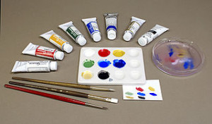
What is gouache?
Gouache is opaque watercolour, created by combining finely ground pigment with binders and then either partially dried and stored in a tube, or completely dried into a pan. The colors in my photo above are Windsor and Newton Artists Gouache. Many of the Windsor and Newton line use period pigments and binders such as gum Arabic. Some period pigments, such as Lead White, are also available\ and come with safety warnings.
You can also use regular transparent watercolour on a scroll. I used authentic Japanese-made watercolours when creating both His Majesty’s Chivalry scroll and Uji-Two’s Torse scroll. They work well. Chinese ink stick colors work well, too. Some calligraphy-specific coloured inks give good colour to scrolls. Personally, I avoid acrylic or oil colour for basic SCA scrolls. They may be appropriate for some kinds of non-traditional scrolls, however.
A word about calligraphy pens
Yes, Dear Readers, I use a cartridge pen for 99% of my scroll work. I do this for several reasons. The pen I use is a Rotring Art Pen. It contains archival quality ink, fits nicely in my arthritic hand, and is completely reliable. The stainless steel nibs refuse to die. When I packed up from the Barony of al-Barran in the Outlands 10 years ago, I left ink cartridges in the pens. There they stayed for about six years. Do NOT do this.
When I was strong enough to try Scribing again, I opened the pens and removed the old ink cartridges. I washed out the nibs, put in new ink and nine of 11 of the pens worked as if they were brand new. I cannot say the same for any other brand of pen, including dip pens, I have ever owned.
Can I use a dip pen? Of course. But I hate them. Should you learn to use them and use them well? Of course. They are far more period than my cartridge pen. There is no rule that says you must start with a dip pen, or a quill pen, or anything in particular. I simply request you not learn calligraphy using a calligraphy marker, because they do not enforce correct technique.
The correct technique with a calligraphy pen is to draw each stroke of the pen either towards the body or towards the hand, whenever possible. To push the stroke of the pen away from the hand or body often causes the pen to “barf” or “splat” on the paper. Practicing a consistent pressure using whatever pen you choose is more important, combined with practicing letter spacing, equal letter height and the wide/narrow aspect of letters.

This is where the graph paper comes into play. Graph paper has lines, horizontally and vertically. It makes letter height, spacing and so forth much easier while saving time drawing lines on blank paper. You can certainly draw those lines if desired. For practice time, I would prefer you spend the time practicing rather than drawing straight lines using a ruler.
Every Scroll is a Franken-Scroll
Tracing is period. Really. It is why Scribes had exemplars, model books and so forth. Designs were used and re-used. Particularly complicated pages were laid out, proportioned and set up on cheaper material than the “good” paper or vellum before ink or paint was ever laid on to the expensive stuff. We see evidence of graphite marks, pin-pricks and other tracing methods in period manuscripts.
I hope at some future RUSH sessions we can get into a University library’s manuscript/special collection to see actual period manuscripts as examples. We did this once upon a time, saw first-hand such things as tracery, the way paints lay on top of vellum, and the lack of perfection in medieval manuscripts that we still feel are marvels to behold.
Lay out or design the scroll on graph paper first. Cut and paste copies of sketches, award devices or recipient devices, knot work, vines or other designs on the graph paper using a glue stick or rubber cement. These adhesives allow some repositioning as you work, to take a trick from High School Journalism class. Lay out the text of the scroll using modern technology. Find and download a free font online that approximates the appearance – especially the letter and word spacing! – of the Scribal hand you intend to reproduce.
Keep in mind you will be making changes to that font to make it period as well as to make it your own. However, making sure the text will fit into your scroll is also important. Use your computer to size and resize the text in your font choice until it meets your needs. Once it does, print, cut and paste it into your scroll mock-up. When I do this, I print the font with an underline. This helps me align it with the graph paper lines of my mock-up.
Continue to play with your mock up, adding and subtracting elements as needed. If you need a picture of a person doing an activity, research period sources to find one that fits your scroll time and place. Save the photo to your computer, and then open it in your photo editor. De-saturate it so the photo is in black and white. Now you can resize the basic drawing to fit your needs, flip it, rotate it and manipulate it to your needs.
When you have the drawing in the basic size, shape and orientation needed, print it. Using a pencil, add the other elements you need, rearrange arms and legs, change garments, add weapons and so forth. Add a blank of the black and white figure to your exemplar book, too. Cut and paste the modified image into your scroll mock-up. Repeat as needed for other elements.
Rough Draft Matsunaga’s Chivalry Scroll
Note that you are NOT copying any page of an extant manuscript. You are taking elements, modifying them to suit the scroll recipient, creating what might be the missing page of that manuscript using your imagination and creativity. Neither are you copying your font printed off the computer. You are using it as a placeholder for your calligraphy hand and ensuring the approximate letter width and size fits in the space needed.
All of the above is done on graph paper, so there should be no excuse for things being off-kilter. You have your ruler, so you can determine the center of the paper and ensure a pleasing and well-thought-out design. You may need to draw circles. Please do not draw them freehand. A shot glass or the neck of an empty beer bottle are about the right size for the badge circles of most AoA or GoA awards. Later, you may want to invest in an architect’s circle template.
Sooner or later, the Franken Scroll mock-up has acquired a form that looks like it will work. It is time for it to move from graph paper to good paper. That, Dear Reader, is the subject of next month’s post.
In the meantime, practice drawing letters in the correct shapes on graph paper. Practice doodling medieval things – beasties, vines, flowers, knot work, Norse long-boat crests, you name it – in your sketch book. Acquire a few basic tools. Visit some resources online and start looking for repeating themes within the same time frames. See if you can spot elements that appear again and again. Perhaps download a color wheel and some information about colour theory. After all, if all you have are the primary colours, you will need it soon!
Look at the calligraphy. Spot how it is drawn, not written. You may even see outlines of letters, later filled in with ink. Hmmmm – drawing letters. Intriguing. You will see graphite guidelines for letters. Notice the differences between early period calligraphy vs. later period Gothic quadrata styles resembling nothing so much as a picket fence. The skill there is drawing many straight lines, equally spaced, and being able to track where to connect the vertical lines to make letters.
Until next month, Dear Readers, here are some resources to take you down the Scribal Rabbit Hole. Email me any time with questions .
I always remain in service to Crown, to Kingdom and the People of my Home, my Beloved Calontir –
Aidan Cocrinn, OL
55th Laurel of Calontir by the Grace of Conn and Sile
Royal Scribe to Their Majesties Matsunaga and Elena
First Cyborg Laurel of Calontir
Scribe Goob
Etc.
hcochran@gmail.com
Resources:


Art Supplies:
John Neak Bookseller THE go-to SCA Scribe place
**Remember to request the 5% SCA discount in the Order Comments Box**
Guild Mirandola –paints, pigments, gold leaf, parchment, Pennsic
Paper and Ink Arts – go to supplier for most stuff
Guild of Limners – pigments, vellum, Pennsic
Cheap Joe’s – basic art materials, cheap
Jerry’s Artarama– more basic materials, always sales
Dick Blick – all the art supplies
Digital Resources:
Folump Enterprises (buy Crossed Quills, if you can get them!)
Michaelangelo Sketchbook article
Medieval Illumination (blog)
ScribeScribbling – the blog of Ian the Green
SCA Scribes and Illumination Facebook Group
SCA Scroll Gallery Facebook Group
Aidan’s Pinterest – see if you can find and follow all the Scribal Pinterest Boards, then follow the other Scribes you find. Warning: Addictive.
Calligraphy:
SCA Calligraphy Bootcamp
Ductus – Line Drawing Template
Calligraphicga this form of writing we do
Illumination
Book of Durrow
Creating Period Pigments
Calontir Resources:
Calontir Order of Precedence – look up names
Calontir Armorial – look up registered devices
The Vatican Library Digitization Project
The Vatican Library Digitization Project ( http://digital.vatlib.it/en/ ) is in the process of scanning, saving and distributing the Library’s collection of documents, with over 4400 of them currently available online.
Documents range from the pre-Columbian Aztec “Codex Borgianus,” to the Mishneh Torah, to fragments of the Koran Kufic, to Virgil, the Iliad and various Bibles. The stated purpose of the project is to preserve all human heritage for posterity and make it available to the public.

Free Bodleian Coloring Book Available for Download
The University of Oxford’s Bodleian Library has released their 2016 Colouring Book, available to download as PDF. (h/t Ms. Aidan)
Other institutions participating in #ColorOurCollections Week can be found at this list on Twitter.
You must be logged in to post a comment.