Most of you, Dear Readers, won’t believe me when I say the basic materials for starting your career as a scribe are incredibly minimal. Primitive, perhaps, is a more apt word.
Many protest they cannot Scribe because their handwriting is horrific and they have no artistic skill. Handwriting is irrelevant, as is your artistic talent and even whether you are left or right handed. What matters is the willingness to learn and practice, openness to trying a new skill and the ability to understand the difference between handwriting and the Scribal Arts.
I’ve been doing this for more years than I’d care to admit. In a pinch, it takes very little to draw pretty letters and make a decent-looking scroll, even under less than ideal conditions. One of my articles down the road will cover “Combat Scribing: The Art and Science of Doing a Scroll under Horrible Conditions.” This is also known as doing a last minute scroll at Lilies War.
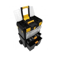
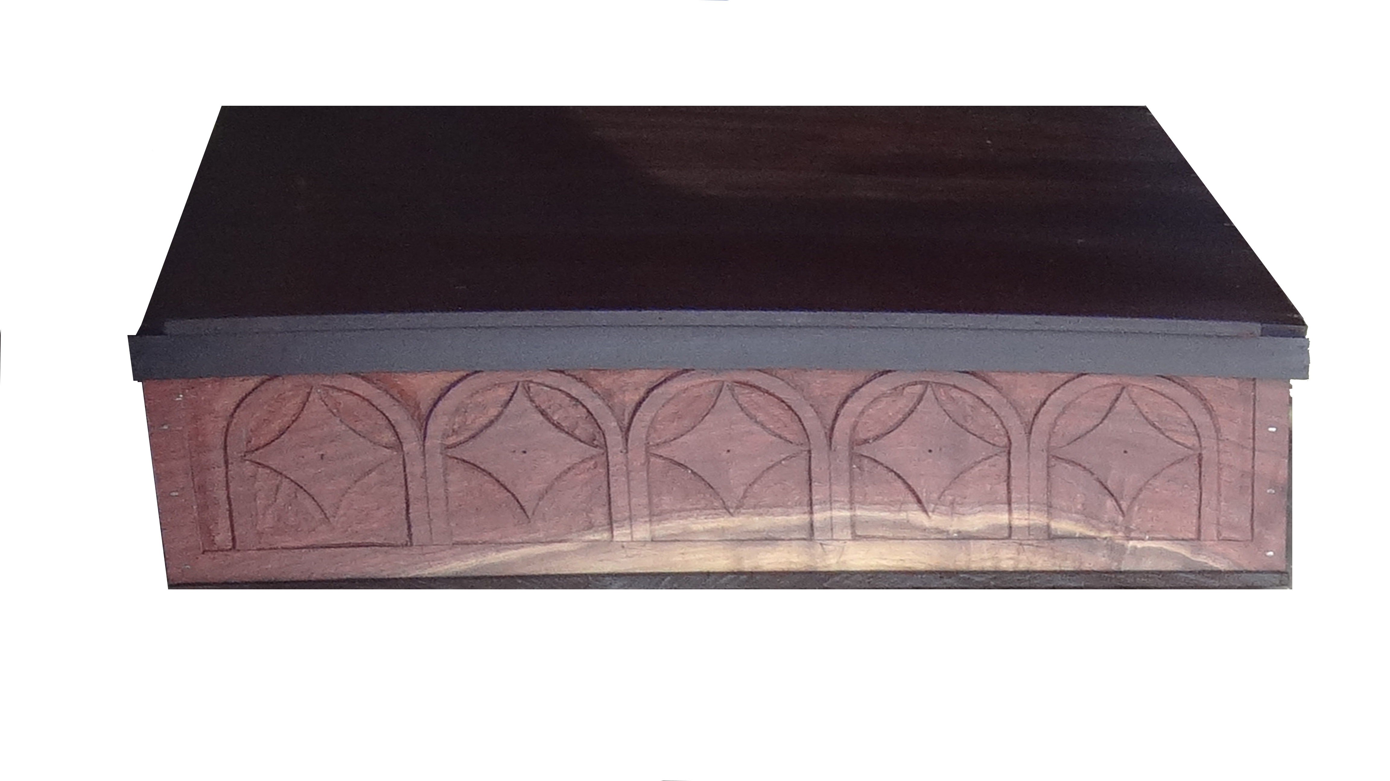
My Rolling Scribe Box looks just like this, except it is camo green.
You do not need my rolling Scribe Box of Wonders, plus a home scribe room full of more cool stuff to do scrolls. At some point, more stuff becomes a distraction. We will start with the bare basics. This series will build from there. Eventually, you will find personal favorites to add to your Kit, as well finding things you feel convenient or helpful beyond the basics.
The Scribe’s Library will grow, too. Invest in Amazon Prime, and learn to scour every method of acquiring good quality used books, as well. Bargain shopping for books will serve you well for your entire Scribe career.
At the end of this article, I list some online resource and essential Scribe books. Always seek online coupon and discount codes before shopping. Free shipping is the most common. Some merchants have begun to recognize the SCA as a significant constituent and offer an SCA discount at checkout. Ask for it. Join all the SCA Scribes related Facebook groups you can find, and get hooked on Pinterest Scribe boards for more online inspiration and resource generators.
Even a few decades ago, these resources were not available, yet now they are lifesavers. Find the online digitized manuscript treasuries and bookmark them. Take classes at RUSH (Royal University of Scir-Havoc) or elsewhere, plus ask a more experienced Scribe if you can sit with them and ask questions. After all, most Scribal Arts are done alone, at home, in our workshops. It is much akin to raising small children– after a while; Scribes long for adult conversation!
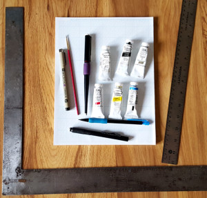
Bare Bones Scribe Materials
Shown above – a right-angle, a straight edge, graph paper, a calligraphy pen, a liner pen, a pencil, a white eraser, a paint brush, and gouache in the three primary colours (red, blue, yellow), plus zinc white, lamp black and gold.
The materials pictured above, with the addition of an un-wobbly workspace, light, a water cup, a palette for mixing paint and the final scroll paper of the Scribe’s choice, are the bare minimum requirements for being a scribe. True story. There are many other pleasant, helpful, and nifty things a Scribe can use to create lovely scrolls. The things in the photo, however, produce just as beautiful a scroll when used to correct effect.
Let us begin.
Calligraphy is not handwriting.
Calligraphy is drawing letters. For this reason, your handwriting matters not, nor does your dominant hand. Practicing on graph paper is the single best way to learn calligraphy, learn it correctly and of getting it right, I have ever discovered. Use the cheapest Dollar Store on sale graph paper imaginable and achieve the same muscle-memory excellence as if you purchased specialty “practice paper” from an art store. Save your money, buy the cheap graph paper.
I taught myself to do calligraphy left handed simply to be able to teach lefties. There are left-handed calligraphy nibs and right-handed nibs. Please purchase the ones appropriate to your handed-ness. It truly helps.
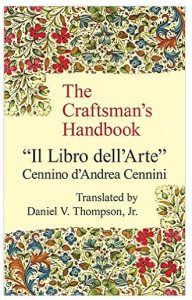
Using a calligraphy pen to draw letters involves following the strokes indicated in a teaching manual for calligraphy. I recommend a beginner book such as Medieval Calligraphy: Its History and Technique by Marc Drogin. This shows a variety of scripts and breaks them down stroke by stroke. It also shows the exact pen-tip (nib) placement, letter height, and historical examples of each script. Many other beginner texts exist, too. The Drogin book is just one of the better known and most available.
Illumination does not require artistic talent.
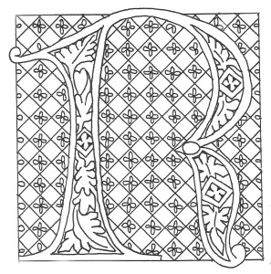
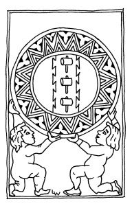
Illumination requires the ability to use basic tools such as a straight edge, and the ability to create a model book or exemplar from doodles and period works. A sketchbook of your best doodles, photocopies of the devices of the Kingdom awards, various heraldic animals, Celtic knot work, swirly vines and acanthus leaves, fancy illuminated initials and so forth, will be your best travel companion. Bored at Court? Sketch. Sketch letters, designs, things you have seen. Practice that Tudor Rose or another motif you saw at the event.
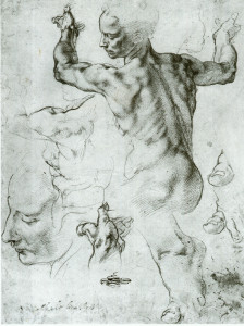
Celtic knot work, the subject of a later article, is merely drafting and dots, by the way. Do not be intimidated. It is ridiculously easy once you know the tricks. After all, if we Irish could do it, anyone can do it. Look online at Michelangelo’s sketchbooks. They were designed to get the proportions and placement of his figures correct, not to be as beautiful as his finished work. When called upon to create a scroll, you will have an idea book of sketches and designs ready.
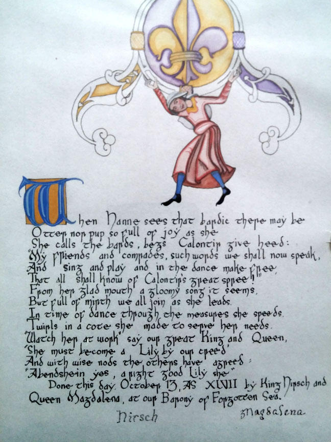
Illumination also requires the ability to manipulate a paintbrush and to color within the lines. Most of us learned these skills in primary school. We perfect these through practice. Practice is widely available in the Calontir Scribal world by helping the Royal Scribe paint pre-print scrolls. These are scrolls in which the calligraphy and line art for the illumination has already been done by another Scribe, and then photocopied onto heavyweight paper. Beginning (and sometimes also advanced) Illuminators paint the preprints using gouache paint, just as they would paint an original scroll.
What is gouache?
Gouache is opaque watercolour, created by combining finely ground pigment with binders and then either partially dried and stored in a tube, or completely dried into a pan. The colors in my photo above are Windsor and Newton Artists Gouache. Many of the Windsor and Newton line use period pigments and binders such as gum Arabic. Some period pigments, such as Lead White, are also available\ and come with safety warnings.
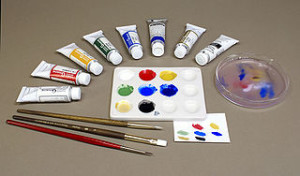
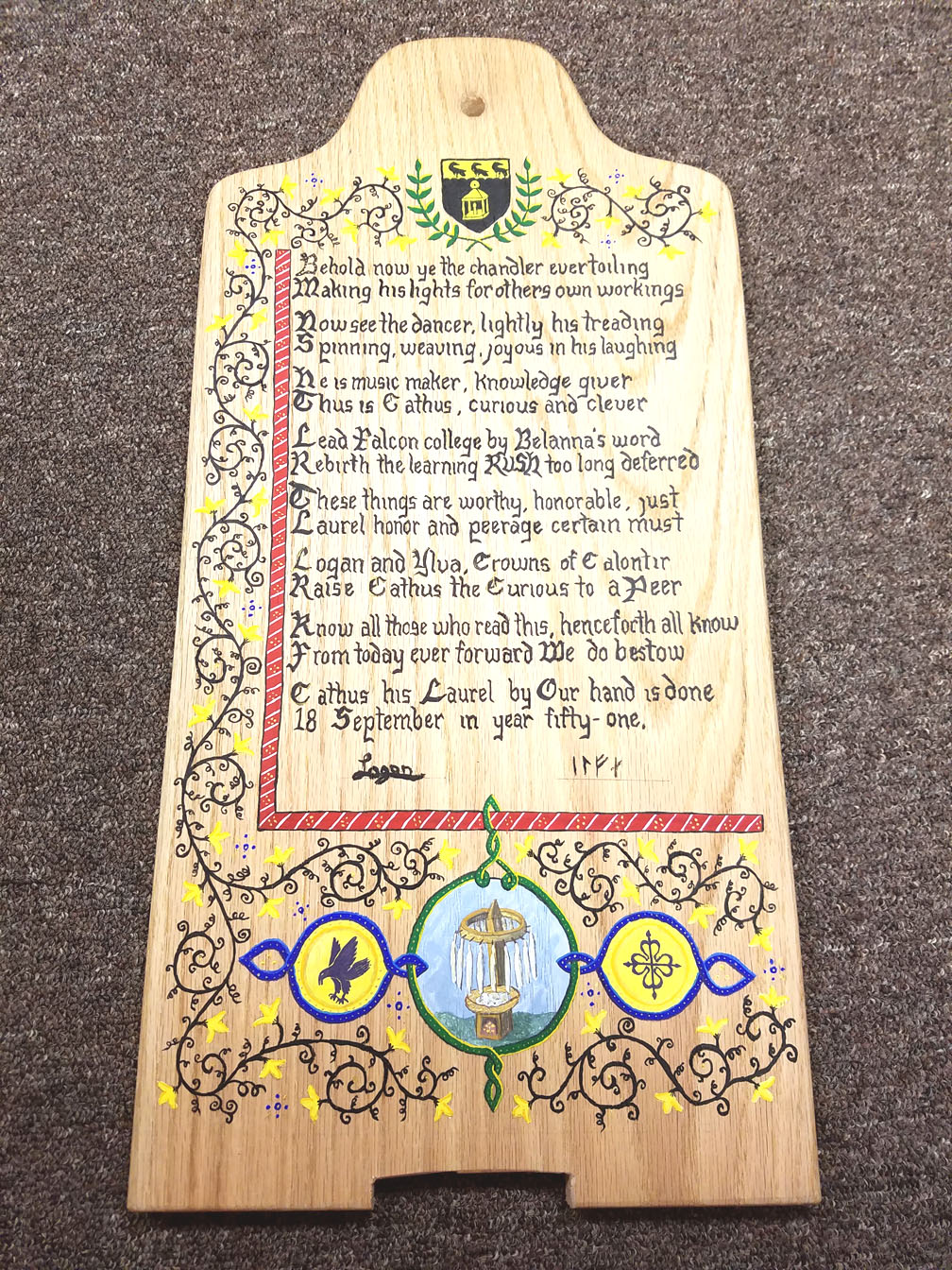
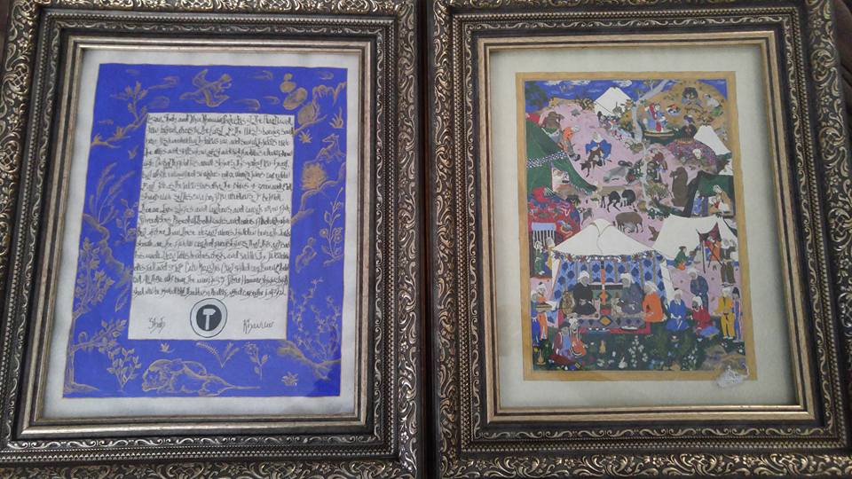
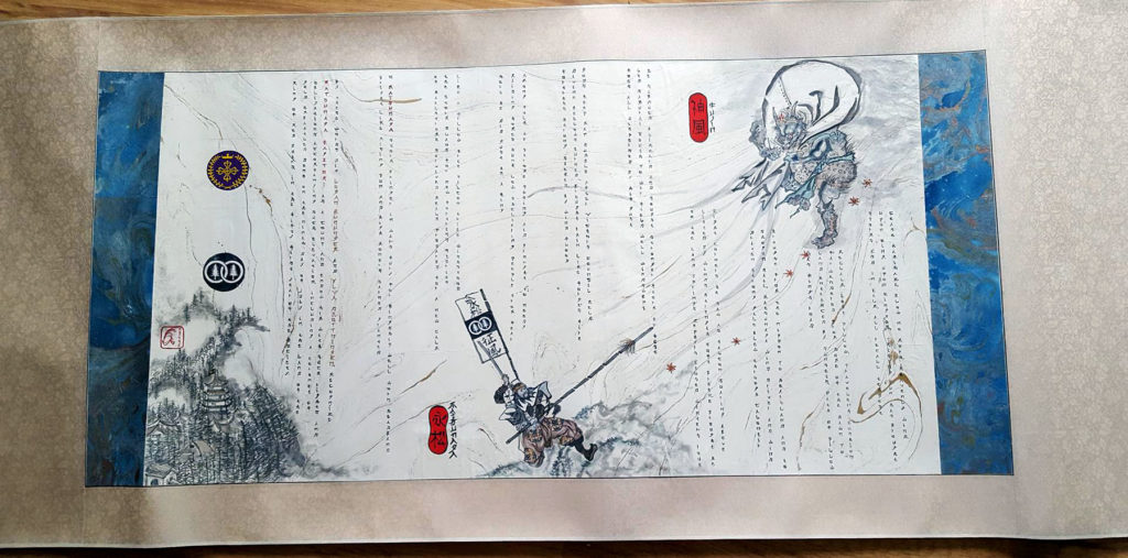
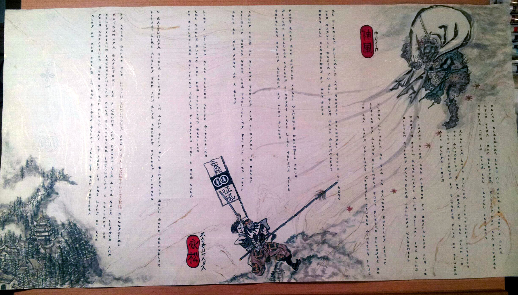
You can also use regular transparent watercolour on a scroll. I used authentic Japanese-made watercolours when creating both His Majesty’s Chivalry scroll and Uji-Two’s Torse scroll. They work well. Chinese ink stick colors work well, too. Some calligraphy-specific coloured inks give good colour to scrolls. Personally, I avoid acrylic or oil colour for basic SCA scrolls. They may be appropriate for some kinds of non-traditional scrolls, however.
A word about calligraphy pens
Yes, Dear Readers, I use a cartridge pen for 99% of my scroll work. I do this for several reasons. The pen I use is a Rotring Art Pen. It contains archival quality ink, fits nicely in my arthritic hand, and is completely reliable. The stainless steel nibs refuse to die. When I packed up from the Barony of al-Barran in the Outlands 10 years ago, I left ink cartridges in the pens. There they stayed for about six years. Do NOT do this.
When I was strong enough to try Scribing again, I opened the pens and removed the old ink cartridges. I washed out the nibs, put in new ink and nine of 11 of the pens worked as if they were brand new. I cannot say the same for any other brand of pen, including dip pens, I have ever owned.
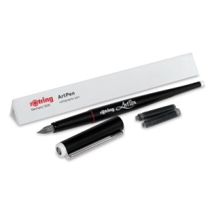
Can I use a dip pen? Of course. But I hate them. Should you learn to use them and use them well? Of course. They are far more period than my cartridge pen. There is no rule that says you must start with a dip pen, or a quill pen, or anything in particular. I simply request you not learn calligraphy using a calligraphy marker, because they do not enforce correct technique.
The correct technique with a calligraphy pen is to draw each stroke of the pen either towards the body or towards the hand, whenever possible. To push the stroke of the pen away from the hand or body often causes the pen to “barf” or “splat” on the paper. Practicing a consistent pressure using whatever pen you choose is more important, combined with practicing letter spacing, equal letter height and the wide/narrow aspect of letters.

This is where the graph paper comes into play. Graph paper has lines, horizontally and vertically. It makes letter height, spacing and so forth much easier while saving time drawing lines on blank paper. You can certainly draw those lines if desired. For practice time, I would prefer you spend the time practicing rather than drawing straight lines using a ruler.
Every Scroll is a Franken-Scroll
Tracing is period. Really. It is why Scribes had exemplars, model books and so forth. Designs were used and re-used. Particularly complicated pages were laid out, proportioned and set up on cheaper material than the “good” paper or vellum before ink or paint was ever laid on to the expensive stuff. We see evidence of graphite marks, pin-pricks and other tracing methods in period manuscripts.
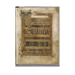
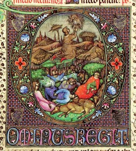
I hope at some future RUSH sessions we can get into a University library’s manuscript/special collection to see actual period manuscripts as examples. We did this once upon a time, saw first-hand such things as tracery, the way paints lay on top of vellum, and the lack of perfection in medieval manuscripts that we still feel are marvels to behold.
Lay out or design the scroll on graph paper first. Cut and paste copies of sketches, award devices or recipient devices, knot work, vines or other designs on the graph paper using a glue stick or rubber cement. These adhesives allow some repositioning as you work, to take a trick from High School Journalism class. Lay out the text of the scroll using modern technology. Find and download a free font online that approximates the appearance – especially the letter and word spacing! – of the Scribal hand you intend to reproduce.
Keep in mind you will be making changes to that font to make it period as well as to make it your own. However, making sure the text will fit into your scroll is also important. Use your computer to size and resize the text in your font choice until it meets your needs. Once it does, print, cut and paste it into your scroll mock-up. When I do this, I print the font with an underline. This helps me align it with the graph paper lines of my mock-up.
Continue to play with your mock up, adding and subtracting elements as needed. If you need a picture of a person doing an activity, research period sources to find one that fits your scroll time and place. Save the photo to your computer, and then open it in your photo editor. De-saturate it so the photo is in black and white. Now you can resize the basic drawing to fit your needs, flip it, rotate it and manipulate it to your needs.
When you have the drawing in the basic size, shape and orientation needed, print it. Using a pencil, add the other elements you need, rearrange arms and legs, change garments, add weapons and so forth. Add a blank of the black and white figure to your exemplar book, too. Cut and paste the modified image into your scroll mock-up. Repeat as needed for other elements.
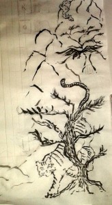
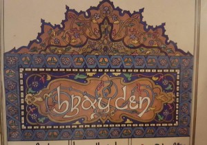
Rough Draft Matsunaga’s Chivalry Scroll
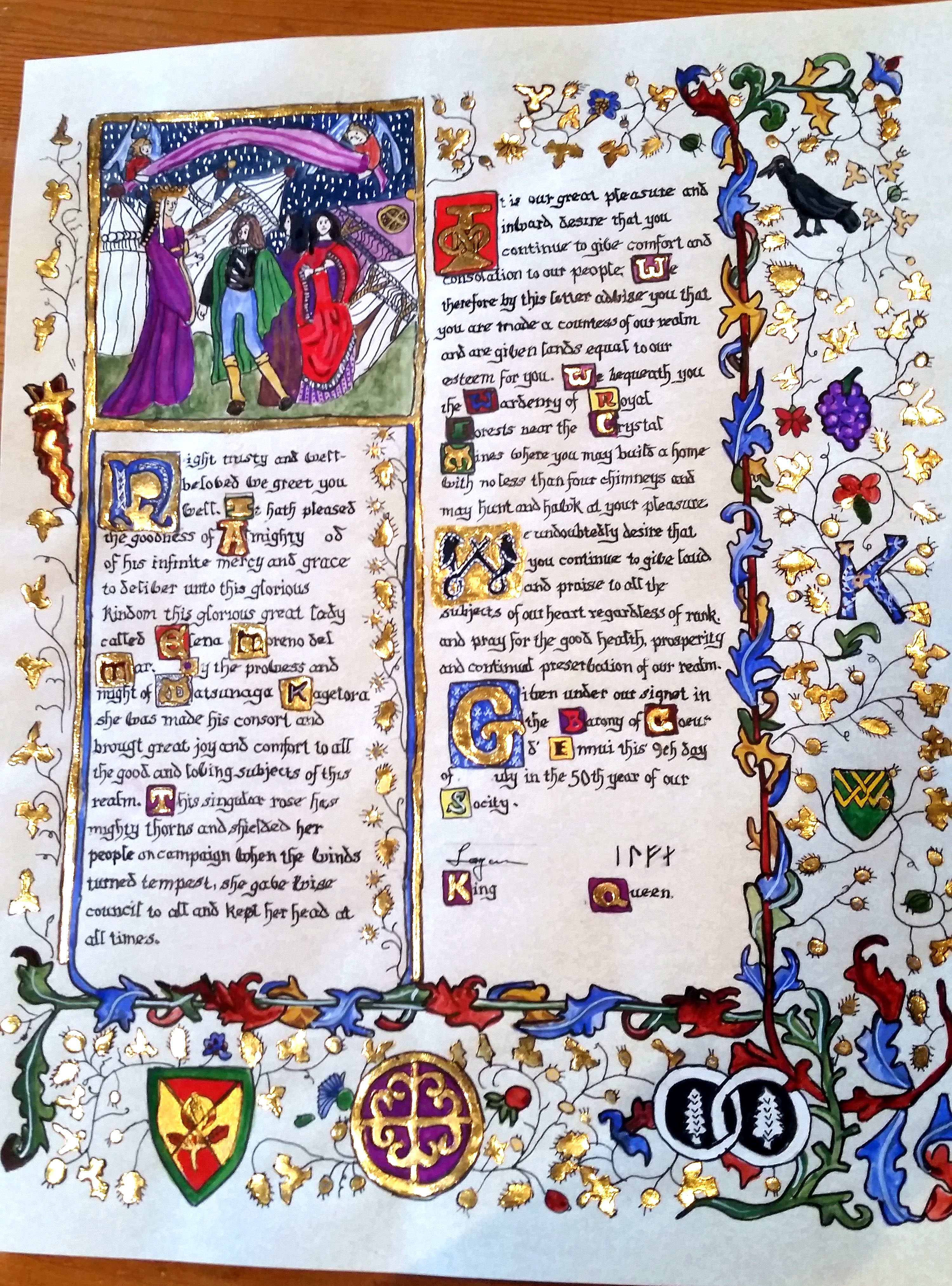
Note that you are NOT copying any page of an extant manuscript. You are taking elements, modifying them to suit the scroll recipient, creating what might be the missing page of that manuscript using your imagination and creativity. Neither are you copying your font printed off the computer. You are using it as a placeholder for your calligraphy hand and ensuring the approximate letter width and size fits in the space needed.
All of the above is done on graph paper, so there should be no excuse for things being off-kilter. You have your ruler, so you can determine the center of the paper and ensure a pleasing and well-thought-out design. You may need to draw circles. Please do not draw them freehand. A shot glass or the neck of an empty beer bottle are about the right size for the badge circles of most AoA or GoA awards. Later, you may want to invest in an architect’s circle template.
Sooner or later, the Franken Scroll mock-up has acquired a form that looks like it will work. It is time for it to move from graph paper to good paper. That, Dear Reader, is the subject of next month’s post.
In the meantime, practice drawing letters in the correct shapes on graph paper. Practice doodling medieval things – beasties, vines, flowers, knot work, Norse long-boat crests, you name it – in your sketch book. Acquire a few basic tools. Visit some resources online and start looking for repeating themes within the same time frames. See if you can spot elements that appear again and again. Perhaps download a color wheel and some information about colour theory. After all, if all you have are the primary colours, you will need it soon!
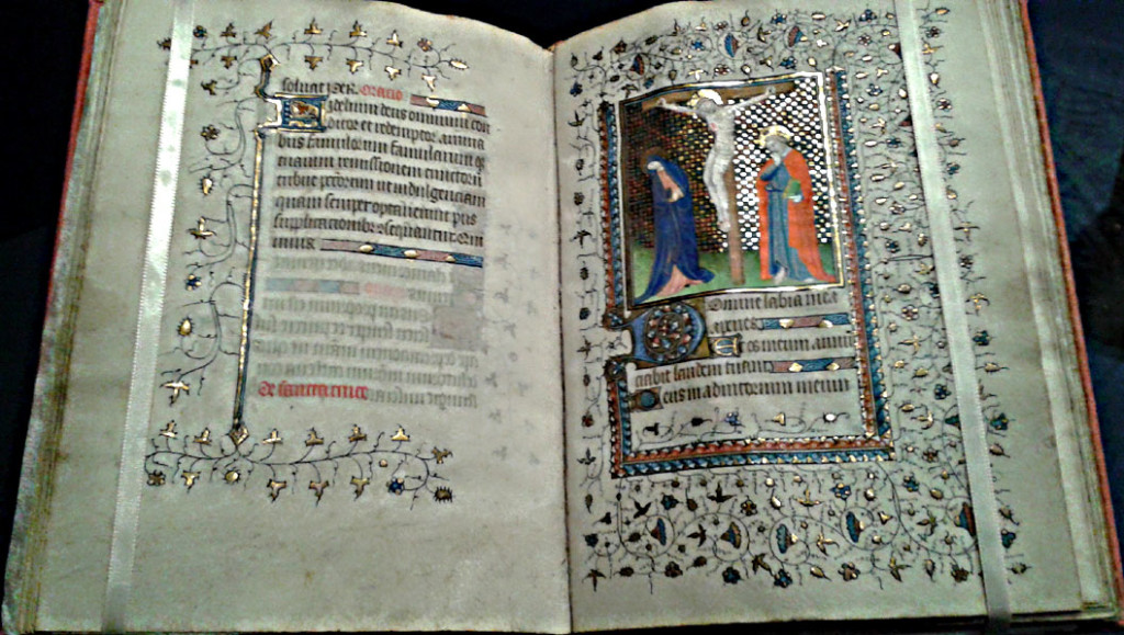
Look at the calligraphy. Spot how it is drawn, not written. You may even see outlines of letters, later filled in with ink. Hmmmm – drawing letters. Intriguing. You will see graphite guidelines for letters. Notice the differences between early period calligraphy vs. later period Gothic quadrata styles resembling nothing so much as a picket fence. The skill there is drawing many straight lines, equally spaced, and being able to track where to connect the vertical lines to make letters.
Until next month, Dear Readers, here are some resources to take you down the Scribal Rabbit Hole. Email me any time with questions .
I always remain in service to Crown, to Kingdom and the People of my Home, my Beloved Calontir –
Aidan Cocrinn, OL
55th Laurel of Calontir by the Grace of Conn and Sile
Royal Scribe to Their Majesties Matsunaga and Elena
First Cyborg Laurel of Calontir
Scribe Goob
Etc.
hcochran@gmail.com
Resources:


 Art Supplies:
John Neak Bookseller THE go-to SCA Scribe place
**Remember to request the 5% SCA discount in the Order Comments Box**
Guild Mirandola –paints, pigments, gold leaf, parchment, Pennsic
Paper and Ink Arts – go to supplier for most stuff
Guild of Limners – pigments, vellum, Pennsic
Cheap Joe’s – basic art materials, cheap
Jerry’s Artarama– more basic materials, always sales
Dick Blick – all the art supplies
Digital Resources:
Left Handed Scribe Tutorial
Folump Enterprises (buy Crossed Quills, if you can get them!)
The Hours of Henry VIII
Michaelangelo Sketchbook article
The Art of the Booke
The Digital Medievalist
Medieval Illumination (blog)
ScribeScribbling – the blog of Ian the Green
Sexy Codicology
The Pensive Pen
Falcon Scribes Facebook Group
SCA Scribes and Illumination Facebook Group
SCA Scribes Facebook Group
SCA Scroll Gallery Facebook Group
Aidan’s Pinterest – see if you can find and follow all the Scribal Pinterest Boards, then follow the other Scribes you find. Warning: Addictive.
Calligraphy:
SCA Calligraphy Bootcamp
Ductus – Line Drawing Template
Calligraphicga this form of writing we do
Illumination
Book of Durrow
Creating Period Pigments
Calontir Resources:
Calontir Order of Precedence – look up names
Calontir Armorial – look up registered devices







You must be logged in to post a comment.